The Chart Guide: How to Choose the Right Visualization for Your Data
When working with data, it's essential to communicate insights effectively. Charts and graphs help us visualize data, making it easier to understand and analyze. With various chart types available, it's crucial to choose the right one for your data and message. In this post, we'll explore common chart types and their uses in data analytics.
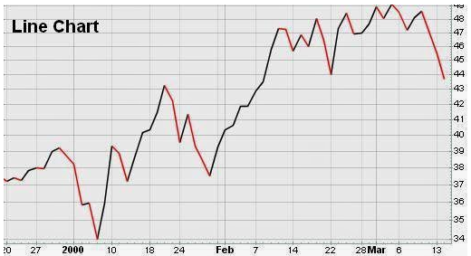
Line Charts
Line charts display trends over time or show relationships between continuous data points. They're ideal for:
- Showing changes in metrics like website traffic or stock prices
- Comparing two or more variables
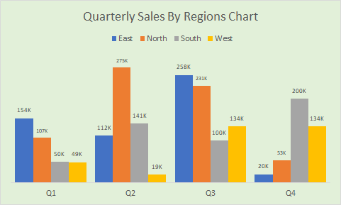
Bar Charts
Bar charts compare categorical data across different groups. They're useful for:
- Displaying categorical data like sales by region or product
- Comparing discrete data points
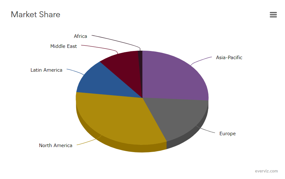
Pie Charts
Pie charts illustrate how different categories contribute to a whole. They're suitable for:
- Showing how different segments make up a total (e.g., market share)
- Displaying a small number of categories

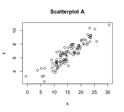
Scatter Plots
Scatter plots reveal relationships between two continuous variables. They're perfect for:
- Identifying correlations or patterns
- Visualizing relationships between variables
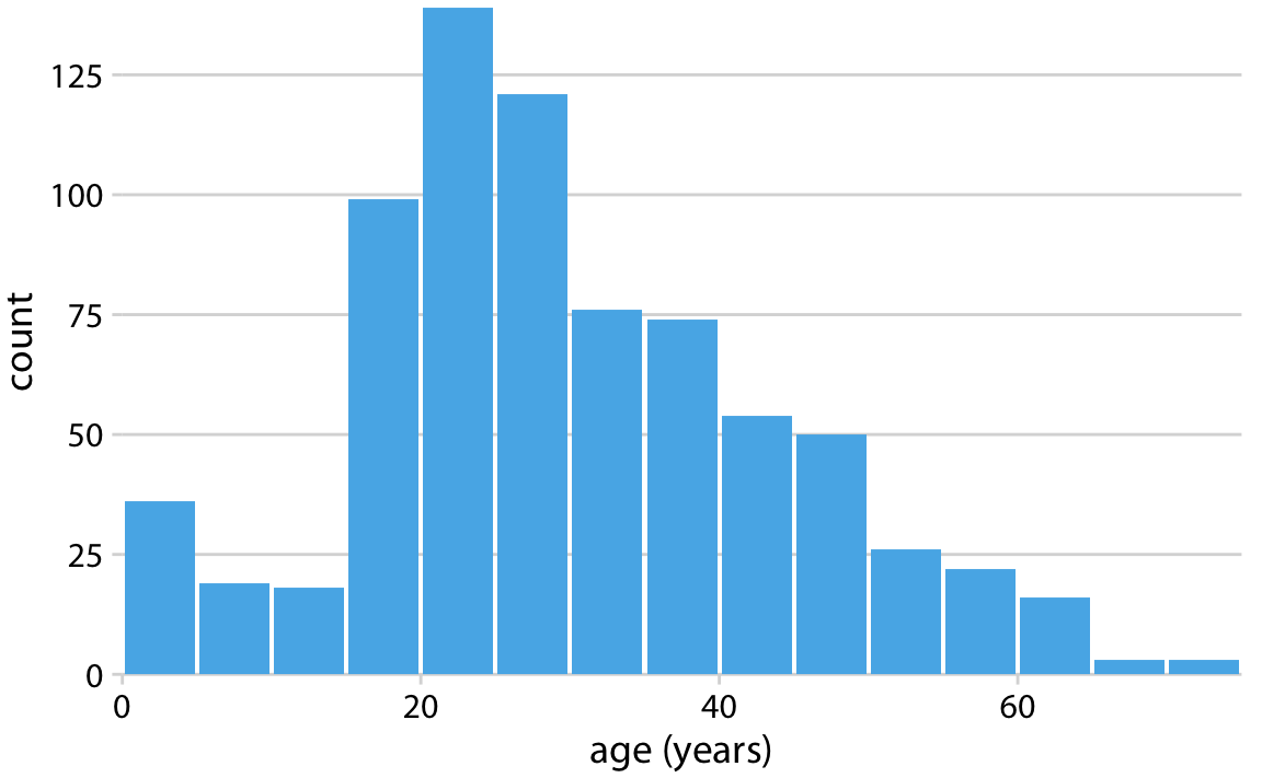
Histograms
Histograms display the distribution of continuous data. They're helpful for:
- Showing data distribution and skewness
- Identifying outliers
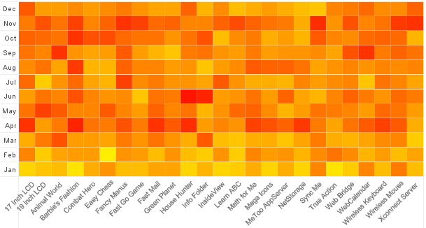
Heatmaps
Heatmaps represent data as colors to show relationships and patterns. They're ideal for:
- Visualizing high-dimensional data
- Identifying correlations and clusters
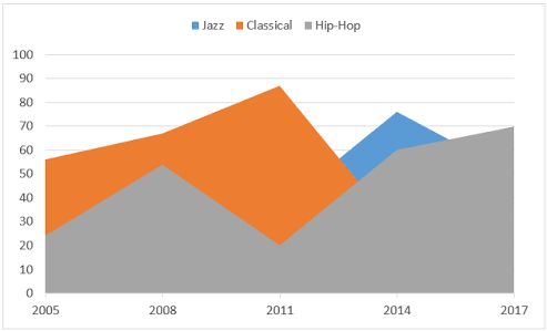
Area Charts
Area charts display cumulative totals over time or show relationships between continuous data points. They're useful for:
- Showing cumulative metrics like revenue or customer growth
- Highlighting trends and patterns
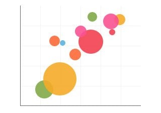
Bubble Charts
Bubble charts display three dimensions of data, using bubbles for each data point. They're suitable for:
- Visualizing relationships between three variables
- Identifying clusters and patterns
Radar Charts
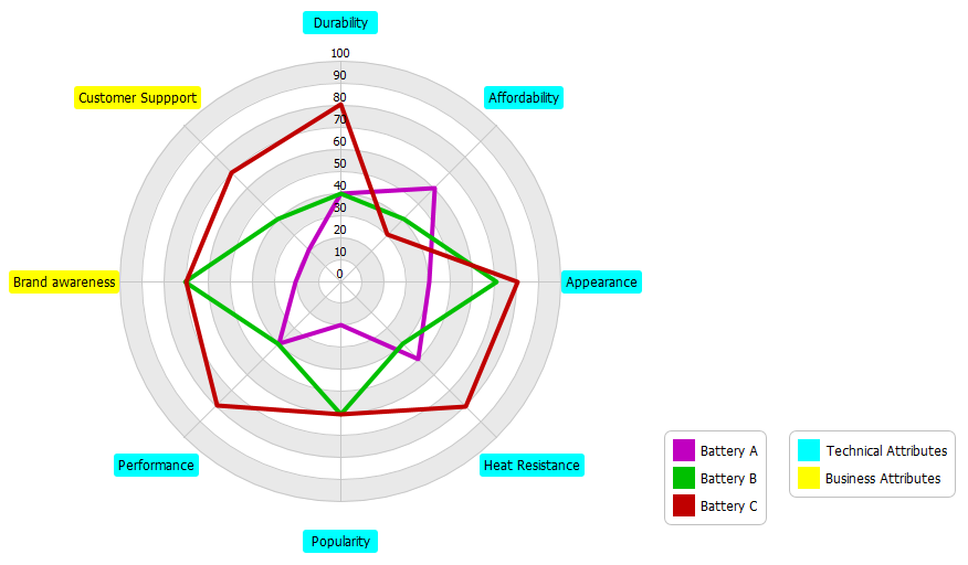
Radar charts compare multiple categories across different dimensions. They're perfect for:
- Visualizing multivariate data
- Identifying strengths and weaknesses
Waterfall Charts
Waterfall charts show how an initial value is affected by a series of positive or negative values. They're helpful for:
- Visualizing how different factors contribute to a total
- Showing the flow of metrics like revenue or expenses

In conclusion, choosing the right chart type is crucial for effective data visualization and communication. By understanding the strengths and uses of each chart type, you can create informative and engaging visualizations that help you and your audience gain insights from data.


Leave a Comment